Thursday, 30 April 2015

OUGD401 - Practical Printed

Once I had all of my designs ready it was time to print them. I printed the posters and flyers on matte stock, and the rest on regular thick off white stock. I'm really pleased with how they have turned out, they're very colourful and vibrant and I can see them working and standing out in places like waiting rooms. 


Unfortunately some of the cards didn't print out exactly double sided, so the logo of thebodypositive was cut off. If this was a real campaign the budget would be much higher and things like this would be avoided. I also had an idea of creating a vinyl sticker to place over mirrors in changing rooms that have some motivational quotes from this campaign but sadly I didn't have the money or time to produce that. 

Overall I'm happy with how my project has progressed and I've produced something that I was passionate about and interested in. 

Wednesday, 29 April 2015

OUGD401 - Practical Collateral

After creating the posters, flyers and cards I decided to mock-up some collateral for the campaign. This includes bus/shelter ads, a badge mock and sticker mock up which I didn't have time to produce physically. I also mocked up a twitter page for the actual campaign, that would tweet positivity to everyone on twitter for as long as the campaign runs, and also answer any questions about the campaign. 


OUGD401 - Practical Posters

Once the cards and flyers were created, I started to focus on the posters. These would be the main part of the campaign, the messages that would be up in schools, universities, even in the workplace. Doctors or hospital waiting rooms and gyms are all suitable places for this campaign to be positioned. 

My posters carry these messages:

"Healthy is a good thing" - aimed at people who may have eating disorders, as healthy sometimes carries negative connotations (if they've gained weight), and can see it as someone inadvertently calling them fat. 

"Stop comparing, start enjoying" - this can be aimed at anyone. Everyone compares themselves to other people, and its important to focus on your own body. This makes a clear link with advertising too, because many people compare themselves to what they see in adverts and set themselves unrealistic body goals. This is a really important message, because when people can't get they bodies to look the same as what they see on tv, or in a magazine it can be very problematic for them.

"Scales are for fish" - This message is aimed at anyone who weighs themselves regularly. If they are looking to gain or lose weight, they should forget what the scales say, and go off if they are happy with the way that they look. 


I wanted to create these posters with positive, light colours that reflect enlightenment and self belief. These posters work well together as a set, and also match with the previous designs that I've created. 

OUGD401 - Practical Cards

Once I had a style for my designs, I started working on some small business card size cards, that can be placed anywhere. They're really cheap to produce because they're so small. Each one has a nice message on, and could really just brighten someones day. These could be left on tables, given out to people on the street or secretly placed in someones bag once they'd bought something e.g. clothes or food. Its all about self acceptance. 
My 3 card designs contain the phrases:

Side 1 - How to get a biniki body:
Side 2 - put a bikini on your body! - be body positive!

Side 1 - Turn that frown :-(
Side 2 - Upside down! :-) - be body positive!

Side 1 - love yourself
Side 2 - Be you(tiful) - be body positive! 


OUGD401 - Idea Development

After looking into guerrilla marketing, I decided that this campaign should be accessible to everyone. I'm going to produce leaflets, posters, flyers, stickers, badges, large ads and hopefully more. I want to create a campaign that will stick in peoples minds, even with a minimal design. 

This campaign would ideally be a national campaign, in all the big cities and towns. Information leaflets and flyers would be situated in gyms, doctors offices and cafe's. It's important to ensure that everyone is aware of this campaign, as the target audience is very large. 

I started with creating the A5 flyers. I wanted them to be colourful and inviting. I looked into some statistics that relate to body confidence, and found that 33% of children say they often worry about the way they look and appearance is the largest cause of bullying in schools. 83% of adults do not feel confident about their body, and 31% of 25-34 year olds say the way they look has stopped them going for a job. 

Source: http://www.berealcampaign.co.uk/

These statistics are frankly outrageous, and something needs to be done. Although the facts are important, I don't want to bring any negativity into my campaign. I would like to focus on the positive, that way no one can be distracted, or form a link with the negativity of these statistics. 

I experimented with block colour for the flyers to begin:


I felt like this was too bold and not very friendly. I liked the layout and the minimal design, so I tried a gradient background instead: 


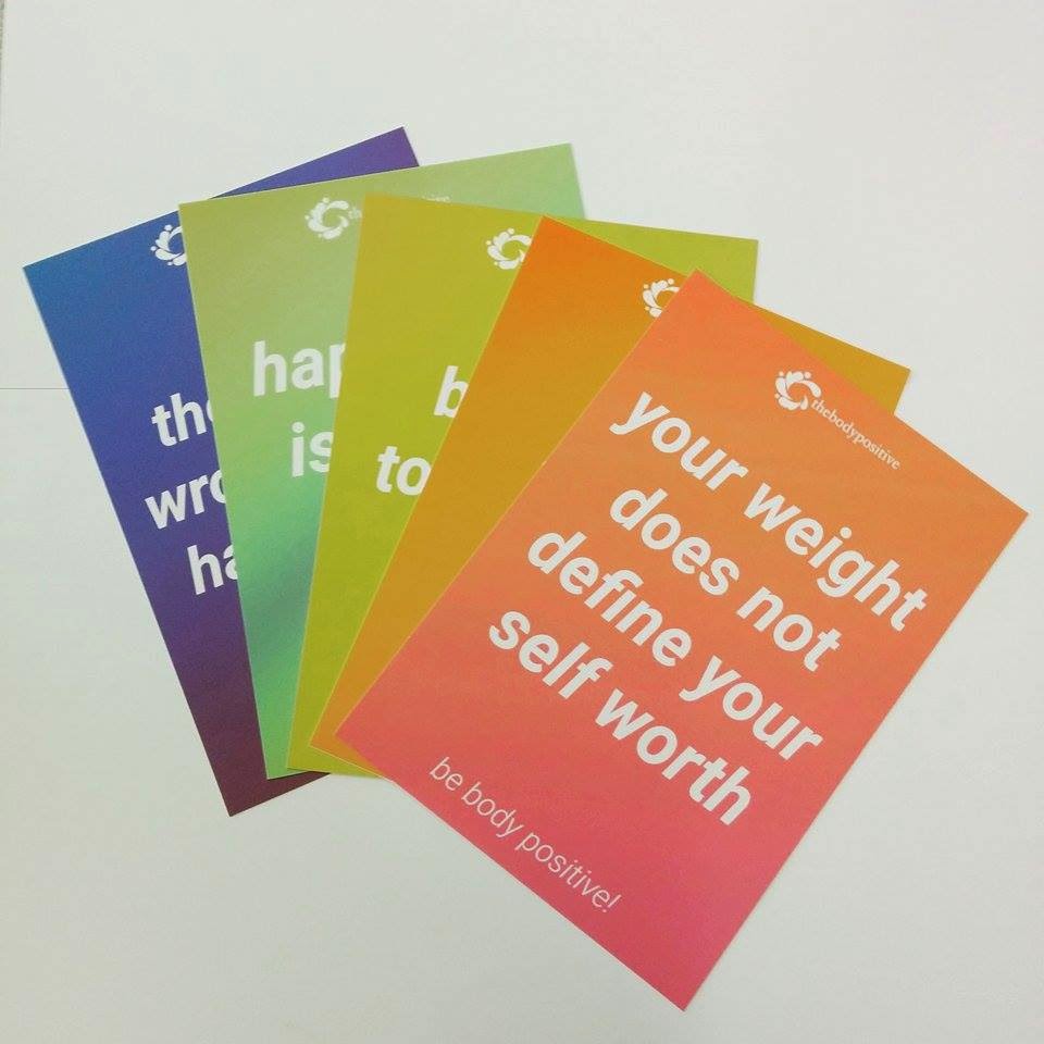
After creating something that I think is suitable, I went on researching body positive quotes (that don't shame any body type and can be aimed at both men and women), I created 4 more flyers in different colours: 


I'm happy with this style for my campaign. Theres something distinct about the flyers, they work well together but they each carry their own message. 

OUGD401 - Practical Body Positive Research

To begin my research, I looked at thebodypositive.org website thoroughly, to make sure I create something that is suitable for them. 

"The Body Positive teaches people how to overcome conflicts with their bodies so they can lead happier, more productive lives. We are dedicated to inspiring youth and adults to value their health, unique beauty, and identity so they can use their vital resources of time, energy, and intellect to make positive changes in their own lives and in the world."

From this I have deduced my target audience is young people and adults, not limited to gender. They are a positive organisation, that want to spark a change in peoples lives. Their website many pictures of people smiling and enjoying themselves, which is reassuring to anyone that visits it. They have published a book that teaches self love and appreciation, and have an online campaign called ThisIsBeauty. 

http://thisisbeauty.org/

As they already have a campaign that focuses on imagery, I would like to create something that is text based, not linking anything to healthy eating, going to the gym, dieting, etc. I would like to inspire and motivate, through just words. I want this campaign to be bold and captivating, making people want to change their attitude towards themselves through a statement as simple as "i love me". 

I have looked into similar campaigns and motivational posters here:


From looking at these posters, its striking how they all feature just text. A minimal design such as these is effective, because the message is plain and simple. This is the direction I want to take my campaign. 

OUGD401 Practical Primary Research

To get a better understanding of my target audience, I conducted some primary research to see what people thought about these adverts. Since I am creating a body positive campaign, I asked people how they felt about current adverts:


I made one suitable for males and females, and the majority of people said that these adverts did not make themselves feel good about their body. This supports my campaign and shows that there is a need for a body positivity attitude within society. 

Tuesday, 28 April 2015

OUGD401 - Practical Tutorial Idea Change

After I had a tutorial and showed my current design work, I got the feeling that my work wasn't really suitable for this project. It should be more about advertising and the portrayal of women, and a publication doesn't really meet the requirements. I decided to change my idea again. I looked back at my essay and my initial research, and found that body image in advertising is one of the biggest problems. Both men and women have unrealistic body ideals because of the way advertisements are produced. Everywhere we turn, theres something telling us theres something wrong with how we look. We're given something to compare ourselves to every day, and I would like to base my practical on this. I have decided to create an ad campaign for thebodypositive.org, an organisation that teaches people how to over come conflicts with their bodies. 

http://thebodypositive.org/index.html

I think that their brand could do with more exposure, and although they are doing really well and have reached a lot of people, I would like to create a campaign that enforces this brand and gives them a wider audience.

Wednesday, 22 April 2015

OUGD401 - Practical Textures

To develop my book I wanted to make my own textures for it, so I could make them bespoke to my project. I used some brusho to create this, and I feel like these could be versatile and useful within my project: 


Tuesday, 14 April 2015

OUGD401 - Practical Further Development

I decided that my book needed something else, some textures or colour to bring it to life. I looked online and found some interesting water-colour textures (which I will re-create myself) and added them to my book to see what they looked like and how it worked. I added this to my front cover and I feel like it's made it more eye catching and bold. 

I like this as it adds a distressed feel to the book and the cross could also represent womens right to vote, which was a big step in womens rights. I added some more textures to some of the pages, and I liked the effect they had on the overall tone on my book:


I would like my book to have a narrative, as these are only my preliminary designs I don't have much to work with, but as I plan to create my own textures for this book I will create them to fit my work. I want the book to become more distressed as you go through it, representing the anger women are feeling as these types of adverts are still being produced. 

Friday, 10 April 2015

OUGD401 - Practical Development

I started off my booklet with a minimal design, using a mixture of bold and regular sans serif font roboto. I think this is effective because its very contemporary and hard hitting. I designed a rough front cover describing what the booklet was about, and a short sentence on page 1 describing what in a bit more detail what the content of the book was.


After that, I designed the general layout for my pages. I wanted them to all look the same, because this represents the continuous stereotyping of women and how adverts portray them still to this day. I wanted to continue the minimal theme throughout, and possibly add some colour accents or textures later on. 


I made the quote the main factor of the design, with the year it was from in large at the bottom, representing a page number. On the next page I had the information and background about the advert and the decade on, explaining to the reader how women were portrayed in this time. I had a similar layout on my other spreads for the other years:


I'm happy with my designs but I feel like something is missing from them, it looks too plain and minimal for the book to be effective in the way that I want. 

Monday, 6 April 2015

OUGD401 - Practical Research

Before I started to make my booklet, I researched into existing ones to get an idea of style and aesthetic: 


These booklets have made me realise that I want a more minimal, hard hitting book. I want it to be very raw, to reflect the struggle that women have encountered throughout the years with being stereotyped and degraded through these adverts. As it is still happening today, I want the booklet to have the same theme throughout, representing the fact that this has been a problem for a number of years.